HEB
Product Design
As a Product Design Intern at H-E-B, I contributed to the development of an internal Design Language Tool that centralized design standards, components, and documentation across digital products. Working closely with designers, engineers, and product teams, I helped create scalable systems that improved consistency, streamlined workflows, and strengthened collaboration across the organization.
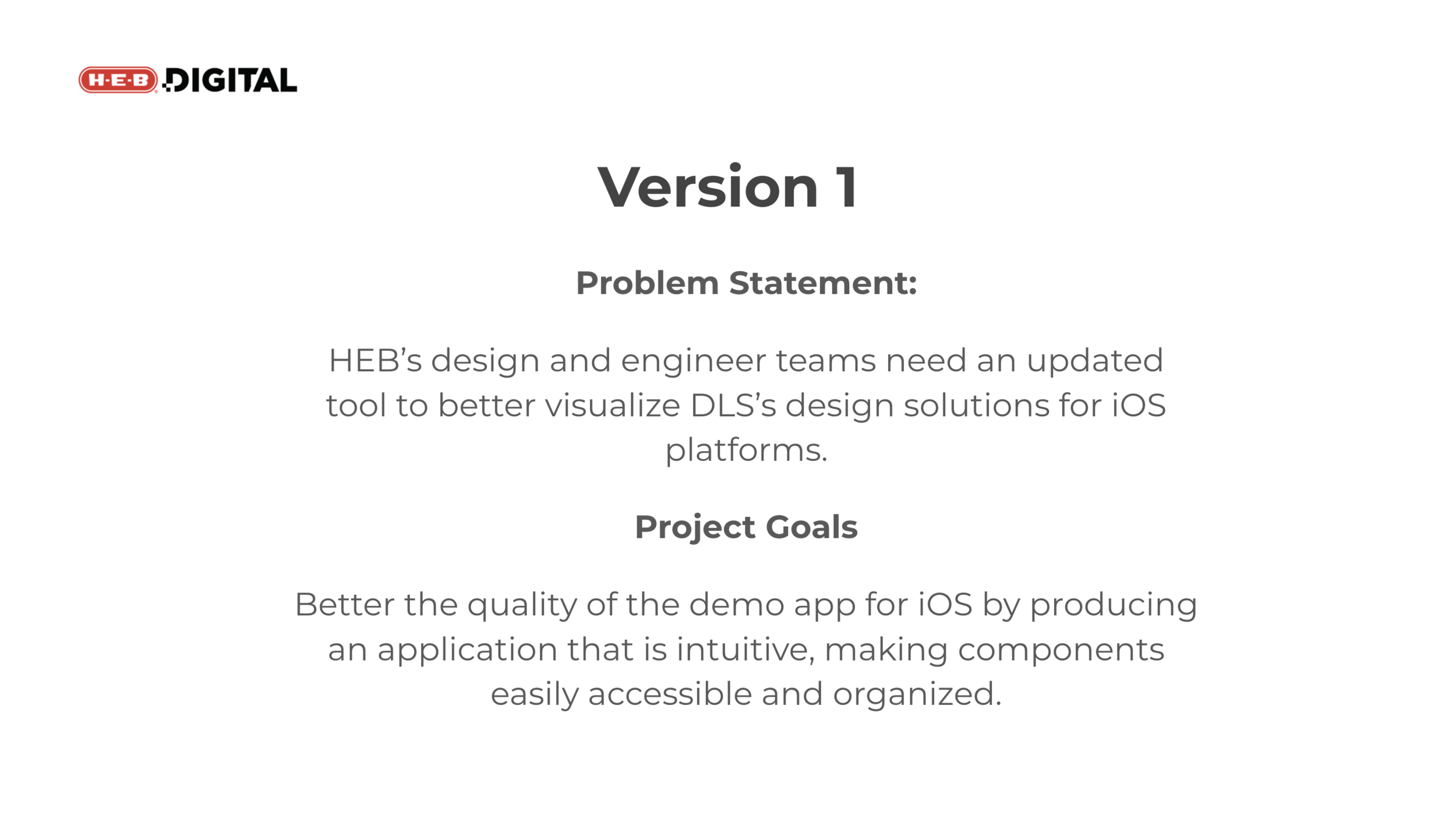
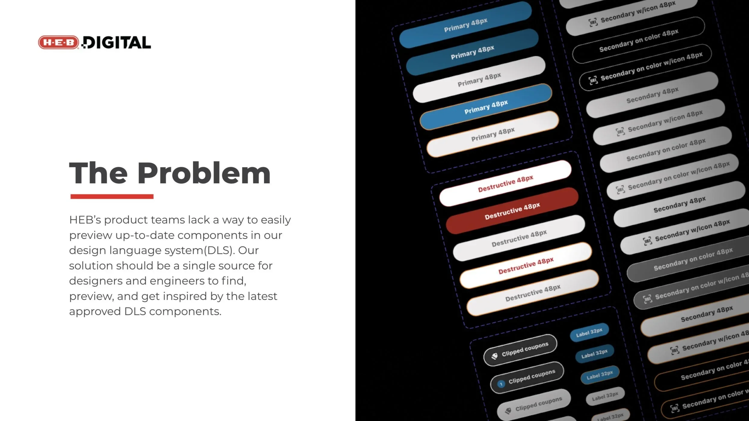
The first task for this project was to come up with a problem statement and project goals for HEB’s DLS Demo Application. I believe I made my initial problem statement and project goals in week 2 or 3. These would be built upon as I learned more about the project and talked with potential users and stakeholders.
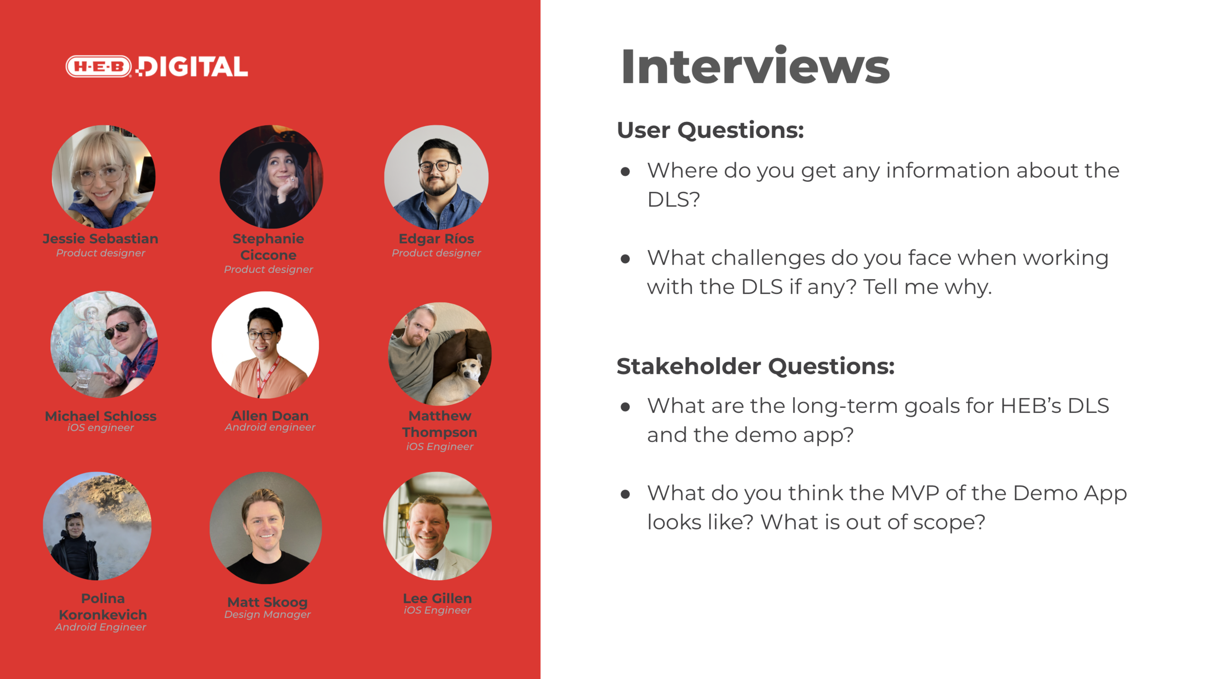
The next step in my process by talking to six potential users of this demo application - 3 designers and 3 engineers. I was also able to talk to 3 stakeholders within my team. These interviews helped me with understanding the problem, the ideation phase, as well as what would make the app successful. Seen on the right are some example questions I was able to ask.
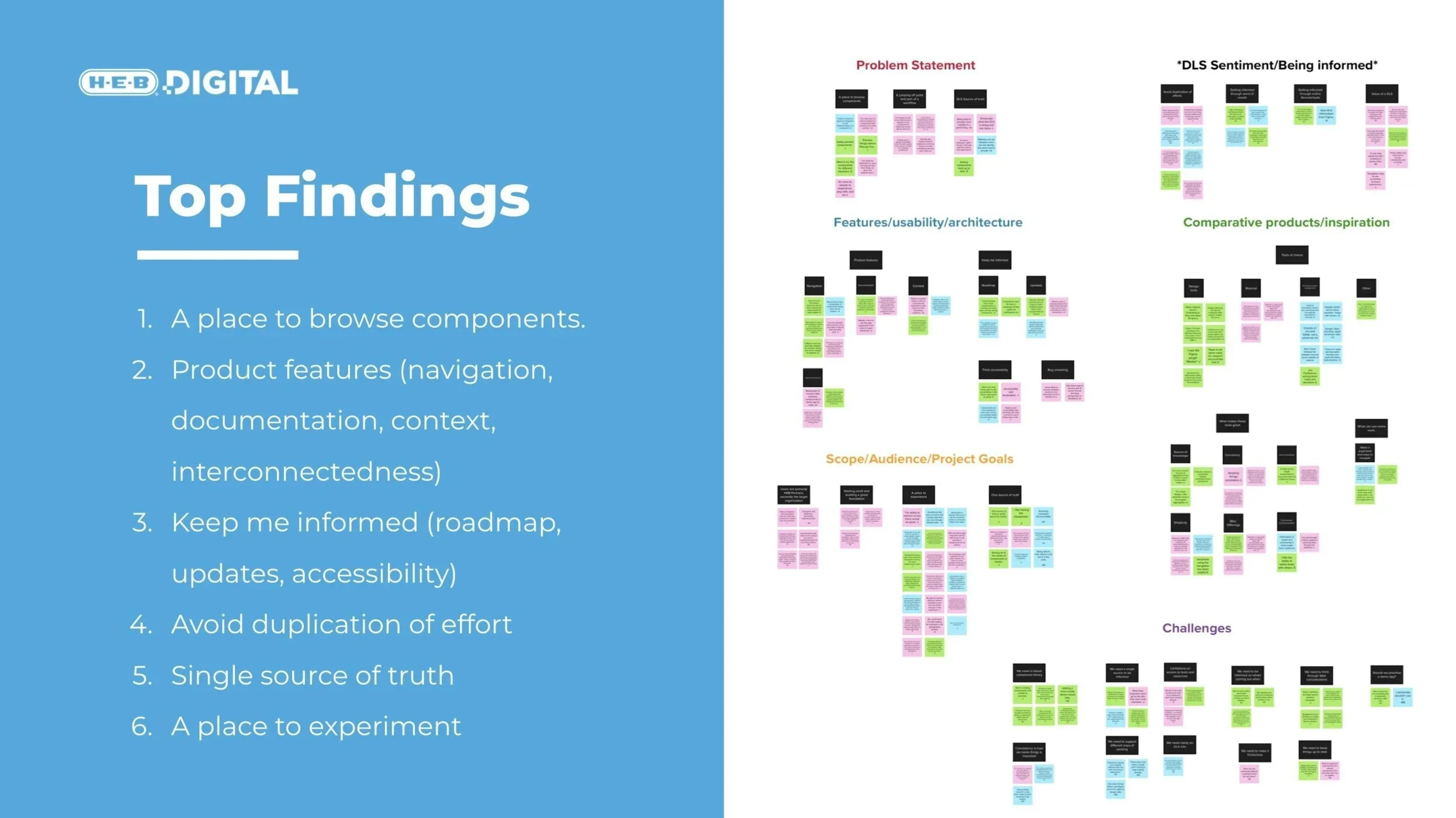
After the interviews, the next step was to extract pertinent information from the discussions and grouping them into themes. I was able to come up with six groups in total. From this, I was able to parse out the top findings.
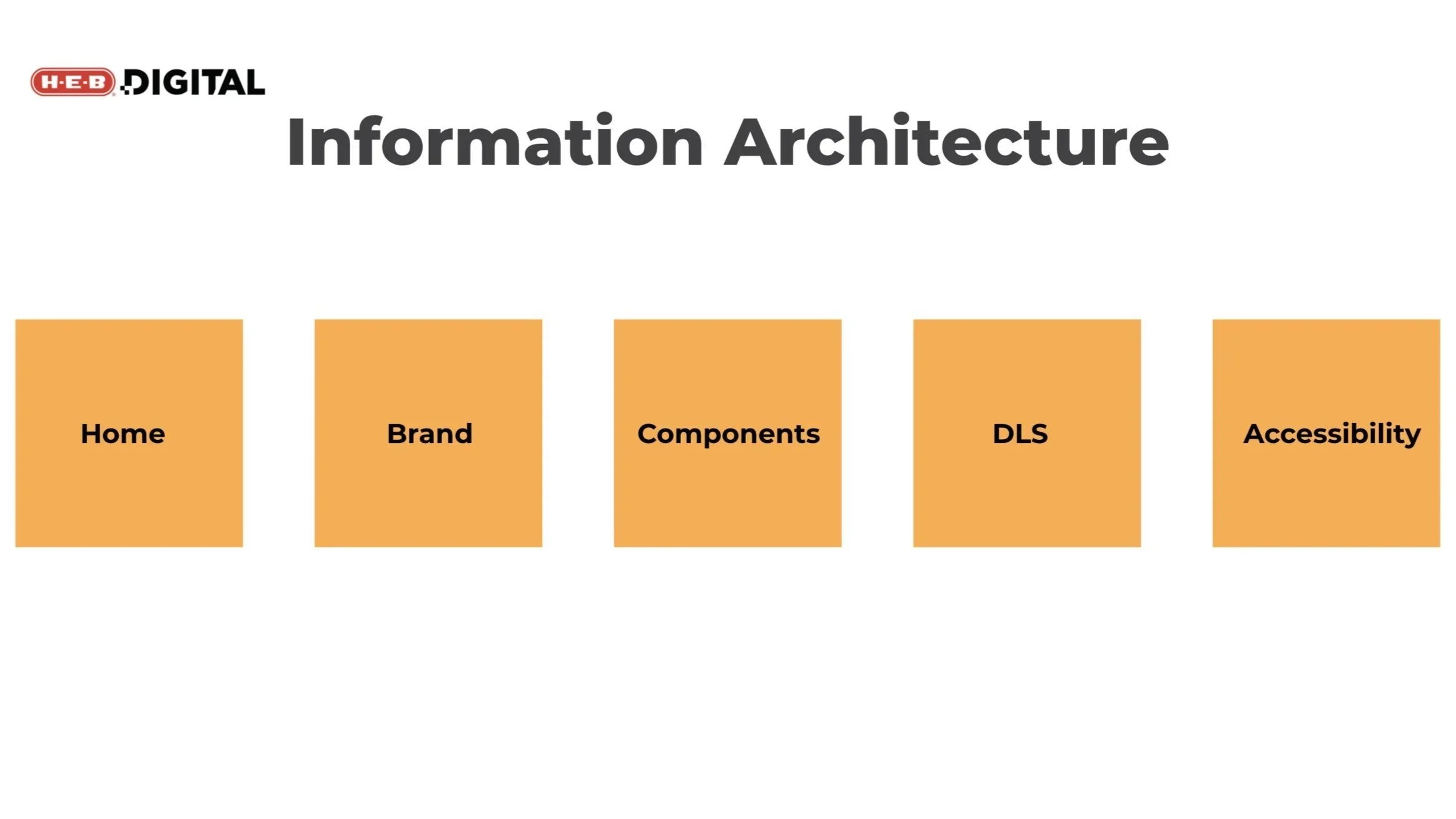
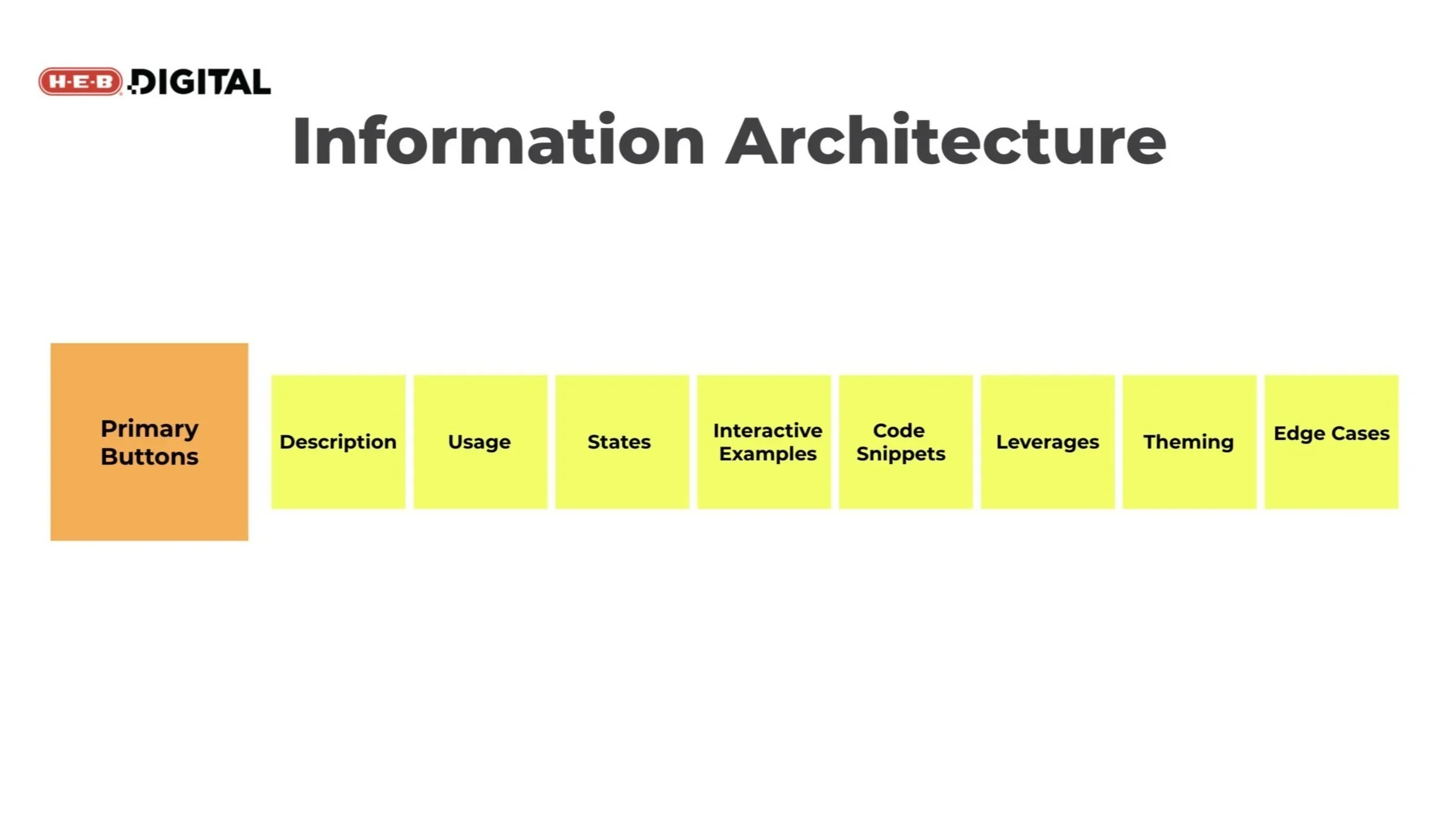
After better determining the problem statement and project goals, I was able to work on information architecture. Through this process, I sorted through the DLS’ assets and grouped them into key buckets that would house various resources within them.
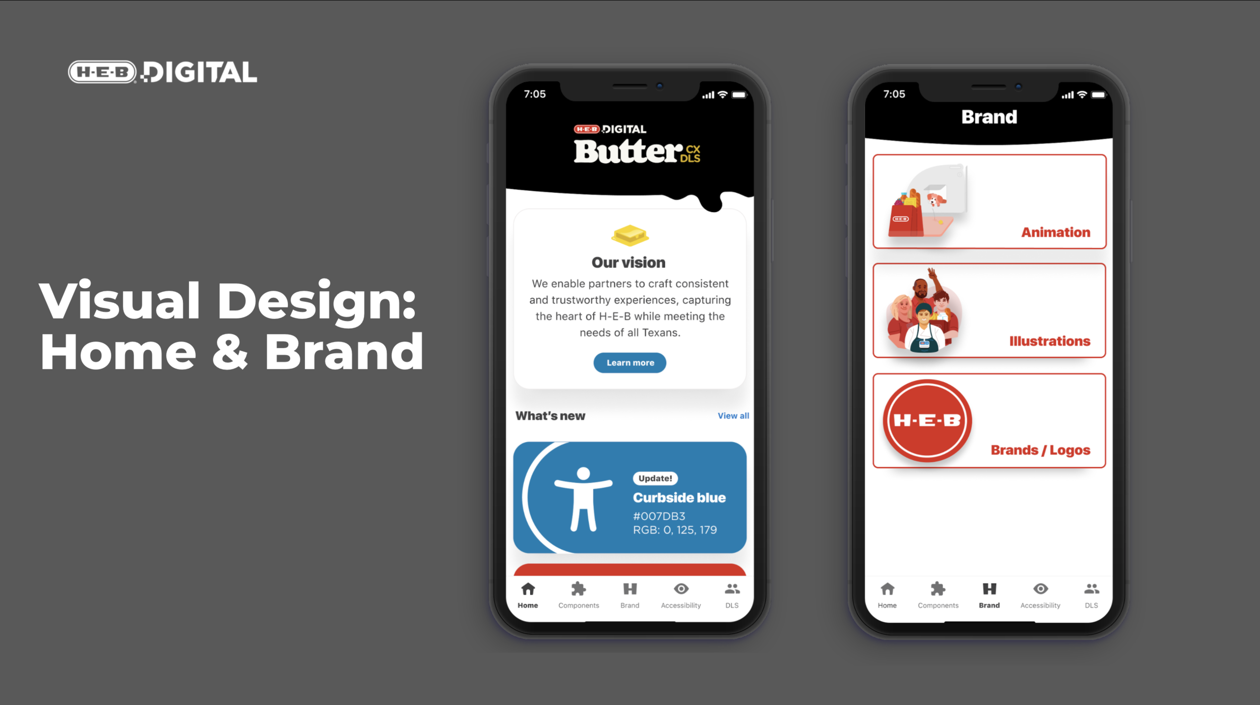
The five key buckets include home, brand, components, a DLS page which will serve as a center to learn about the DLS team, contact the team, and set up office hours. Finally, we have an accessibility page that will include tools and resources to better inform designers and engineers about accessibility guidelines.
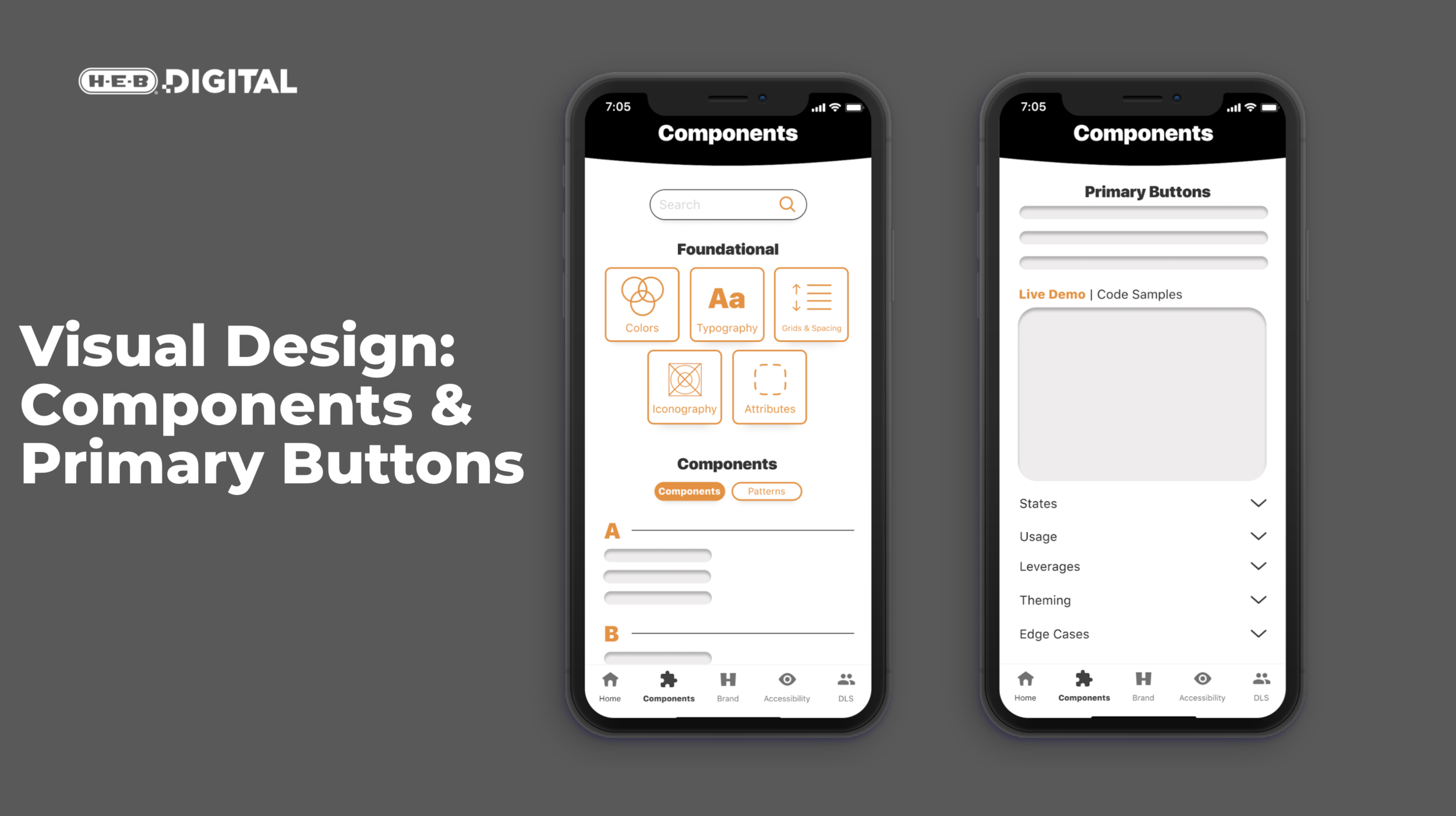
Below is an example of what subsections offered under the components bucket, each component will have a page that offers a description, usage, and states, interactive examples, code snippets, leverages, theming, and edge cases.
Some of these, like the interactive example and code snippets, were designed for though we anticipate these options will not be included in the MVP.
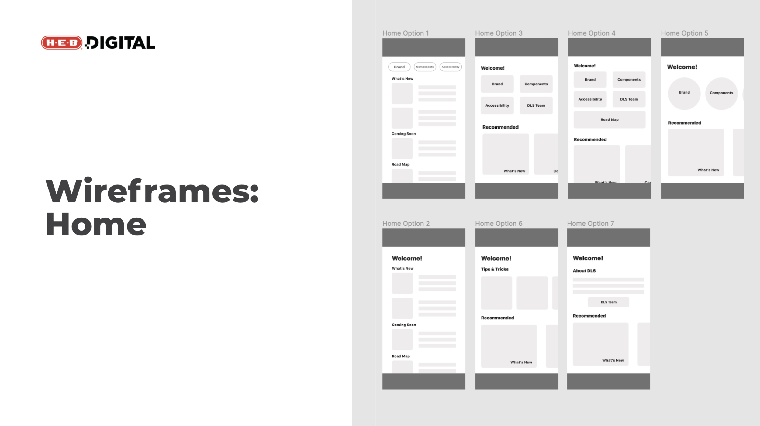
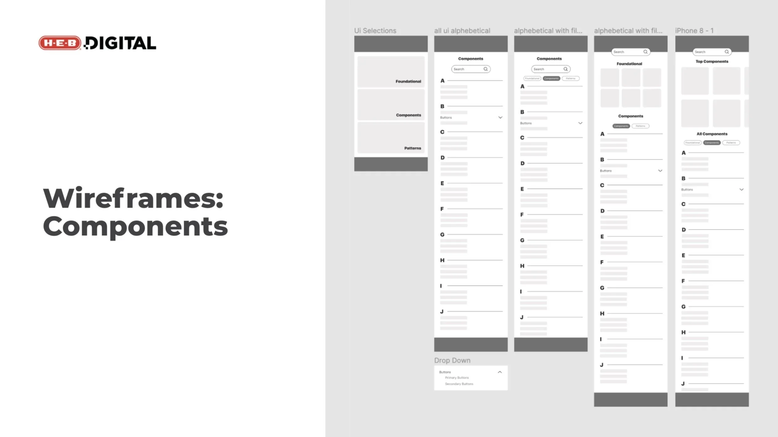
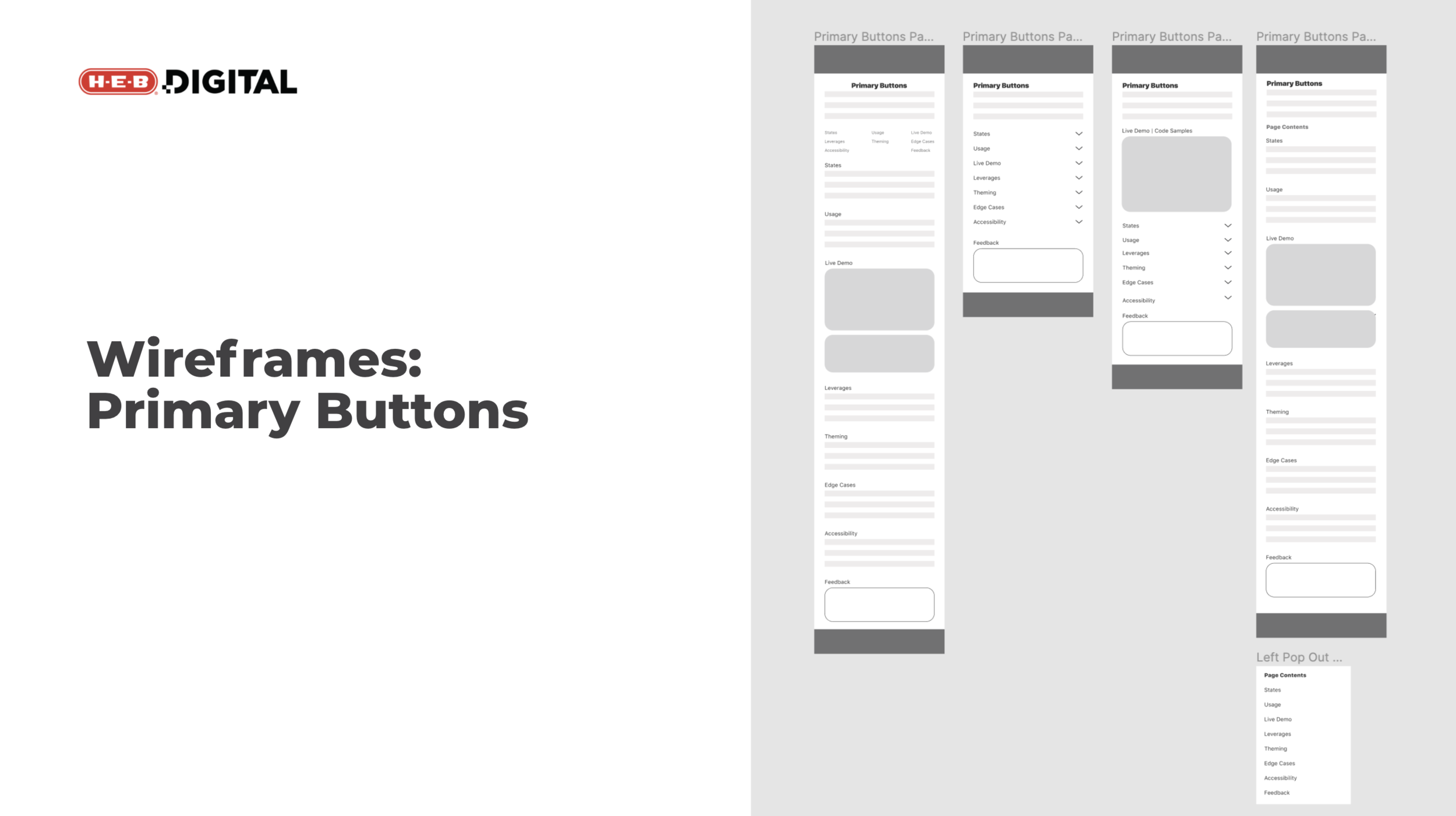
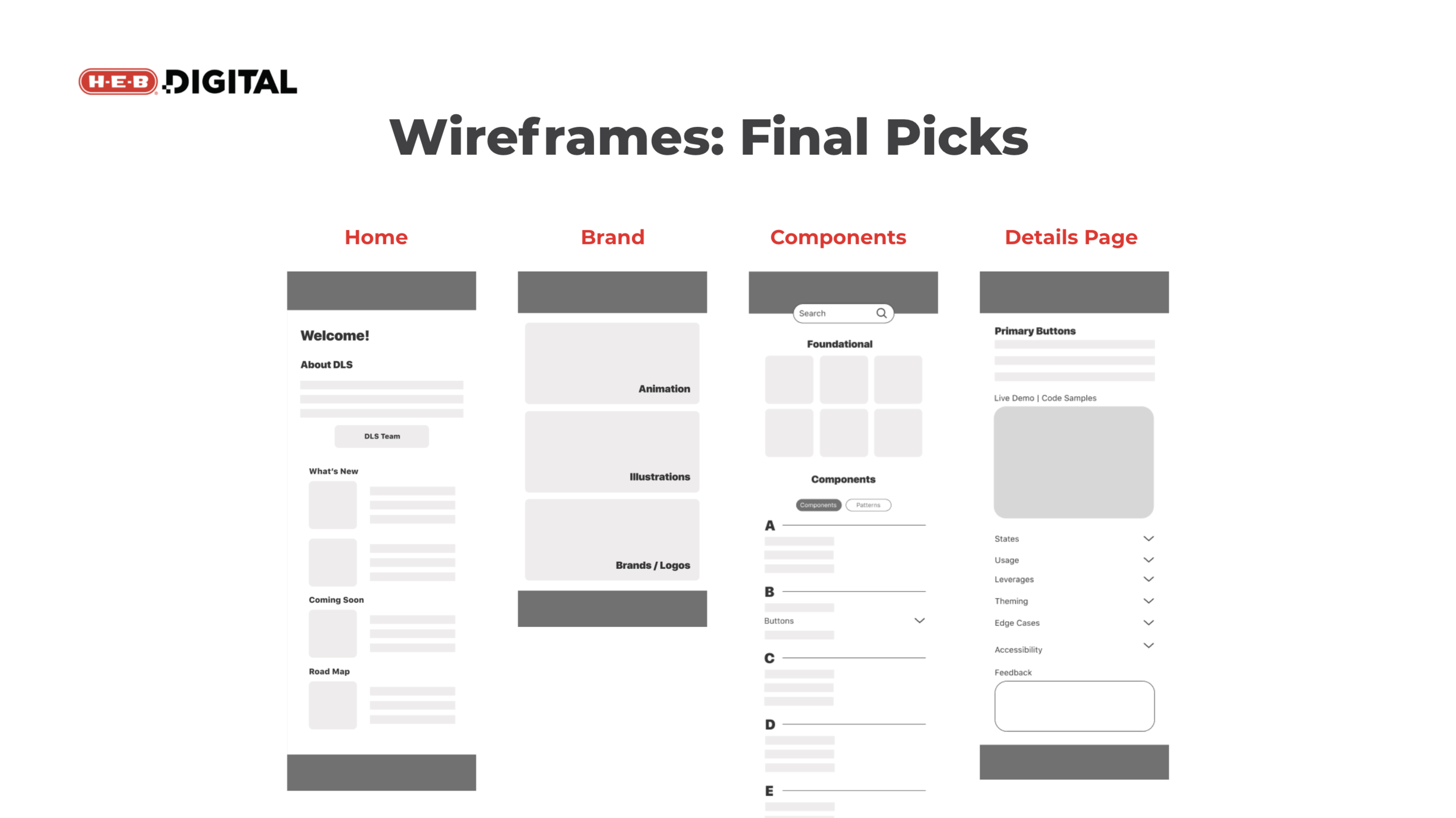
Seen below are the final wireframes I utilized to go into visual design - each created after meeting with the engineering team to hear their thoughts on the wireframes I had initially come up with.
As you can see, especially on the home page, I ended up combining elements from a couple of different wireframes. To offer a bit of variance in the layout, the brand and components pages are a bit different visually. Since there is a finite number of foundational materials, we felt it would be best to group them at the top and allow a user to switch between components and patterns. These elements will be listed alphabetically and subelements will be listed based on use. Finally, the primary buttons or detail page is on the right.